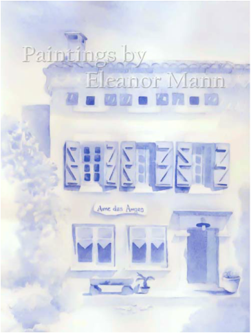
Painting using just one colour.
I made a list of challenges and give my weekly class the task of completing one a month. Last month I posted the challenge of painting with the wrong hand. This month, as we are dealing with tone, I challenge you to paint a picture using only one colour.
Monochrome paintings produce some lovely results and have the advantage of creating unity with very little effort. The tonal range you use will affect the mood of the painting and by altering the tonal pattern you can paint the same scene many times, each one creating a unique atmosphere.
Inexperienced artists find that having to deal with tones, colour mixing, technique and composition in one go is so overwhelming they feel like giving up. Working with one colour takes away the difficulty of colour mixing leaving you to concentrate on the other aspects.
Before you begin, try to identify your lightest and darkest tones. Once these are established you can then compare them with other parts of the picture. I sometimes have my tone chart next to the paper I'm working on. This gives me something to compare the tones with, especially the first tones, as they can seem very dark against the white of the paper.
I painted the example above during a painting holiday in France. It was a hot day and a group of us were painting outside. I was originally painting the view from the bottom of the garden but I began to burn so I walked back and sat in the shade to paint the house instead.
I used French Ultramarine with the intention of adding colour later on. However, as so often happens in watercolour, my original idea was abandoned as my choice of colour seemed to perfectly depict the feeling of the time and place. I did not consciously choose the colour because it is called "French Ultramarine" in fact I only ever refer to it as Ultramarine. It is only since writing for my blog that I have started to use its full name to avoid confusion.
From my palette of six colours French Ultramarine or Burnt Sienna are good choices for a monochromatic painting.
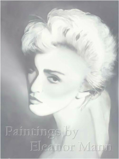
If you are more experienced you could mix primary colours in the palette to produce a secondary or tertiary colour and use that. This is more of a challenge as you will need to mix the same colour for each of the tones used. Below, in my painting of Madonna, I used the three cool primary colours, Winsor Blue (green shade), Winsor Lemon and Permanent Rose to mix a neutral grey. I mean, why make life easy, hey!


 RSS Feed