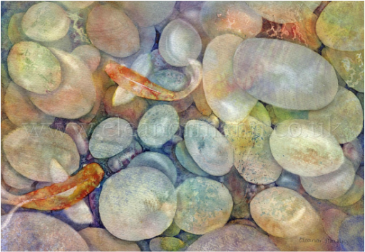
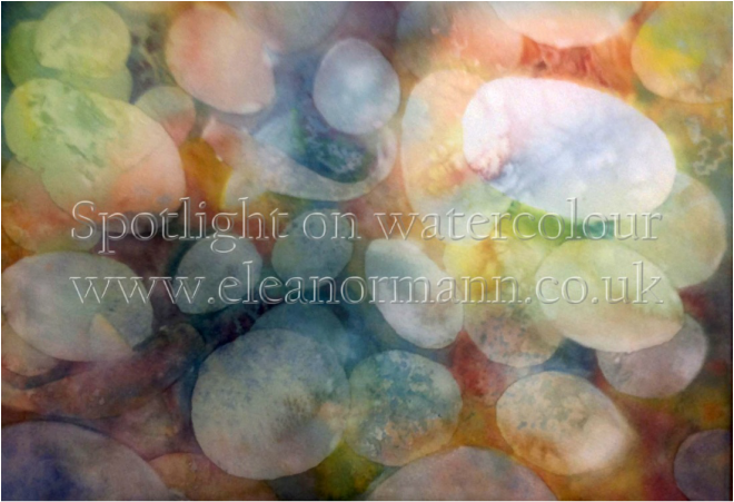
Pebbles, with texture.
"It's a happy talent to know how to play." - Ralph Waldo Emerson.
Here's how...
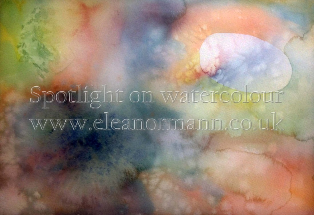
I've decided that my main pebble will be top right, at the focal point. I drew the pebble lightly in pencil.
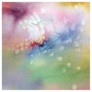
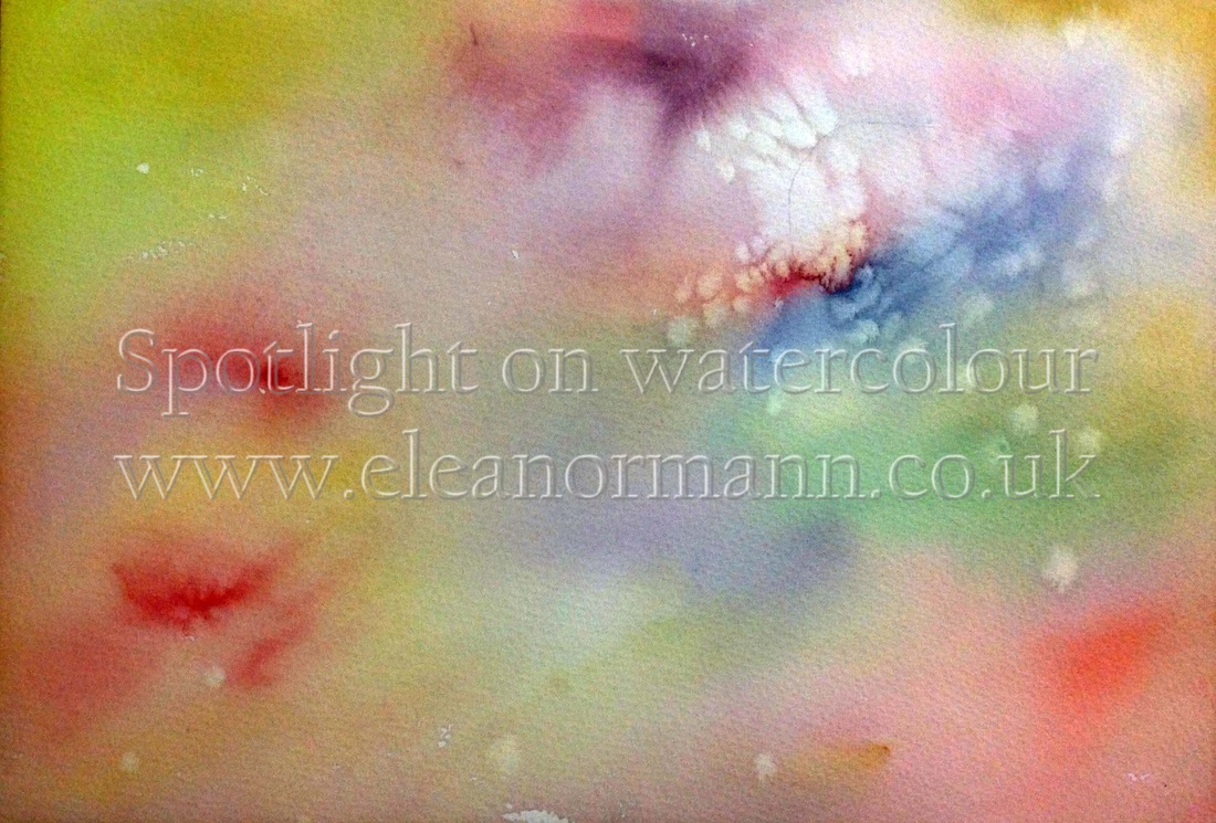
You can wet the paper at this stage if you want, I did not. I diluted the colours that were left in the palette from my last painting and, using a big brush I painted onto the dry paper, fairly quickly.
If you are a slow painter wetting the paper first will give you longer, but remember that it will take much longer to dry, and the paint will dry lighter. I'm trying to persuade you not to, in case you missed that!
Next I picked up my board with two hands and using a swirling motion I allowed the bands of colour to mingle slightly.
I then sprinkled ordinary household salt (see left) onto the top right area where I want my first pebble to be and allowed it to dry.
This next stage shows the first pebble has been left dry but the rest of the paper has been washed with colour. Next I drew a few more pebbles lightly in pencil over areas of the first (dry) wash that looked the most interesting. Then I really got going...
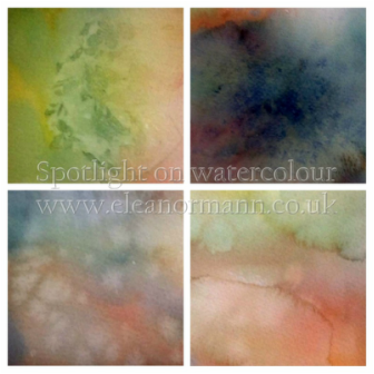
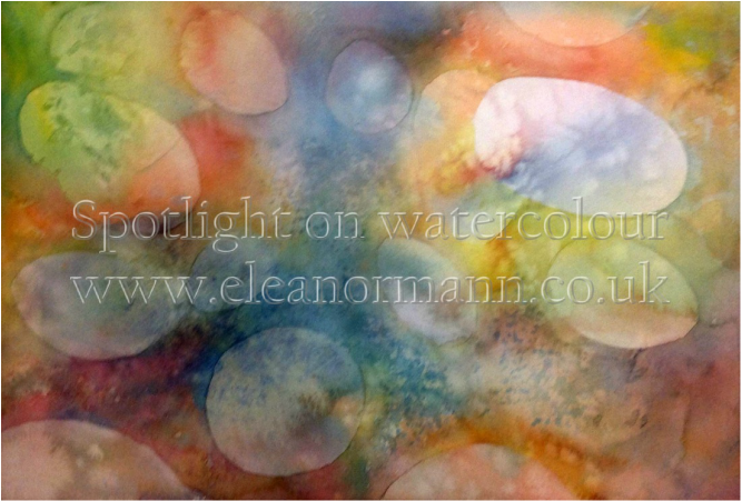
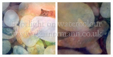
I painted around all the pebbles using any mixtures on my palette. Then placed crumpled cling film on part of the wet wash where I wanted another pebble, and left it there to dry on the paper. (See top left in image on the right).
I diluted granulating colours (in this case French Ultramarine and Burnt Sienna) and dropped them in to one another on the paper. (See top right in image on the right).
I also splattered clean water at the now drying paint with a brush. This creates a similar look to the salt in places but will also creates back-runs where the under wash is dryer. (See bottom left and right in image on the right).
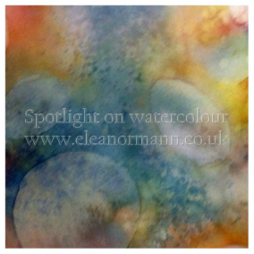
Here you can see how I have painted around the pebbles from the previous washes.
Again, draw more pebbles in areas of the dry wash that look the most textures as it is these areas that are reserved when creating another layer. This time I painted some areas with a big brush and others with a natural sponge. This can only be done if the paper has not been wetted first. The natural sponge needs to be damp, so run it under the tap, squeeze out the excess water and then, if necessary, squeeze it in a towel too.
So that's three washes of colour on the paper now.
Lots more pebbles were drawn in under previous ones. I used more of the granulating colours where the pebbles are getting too small for detail/texture.
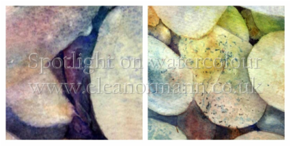
I've used more sponge, scraping back with the edge of a credit card (left hand image) and coloured graphite (right hand image) which I scraped off the pencil with the edge of a scalpel and scribbled.
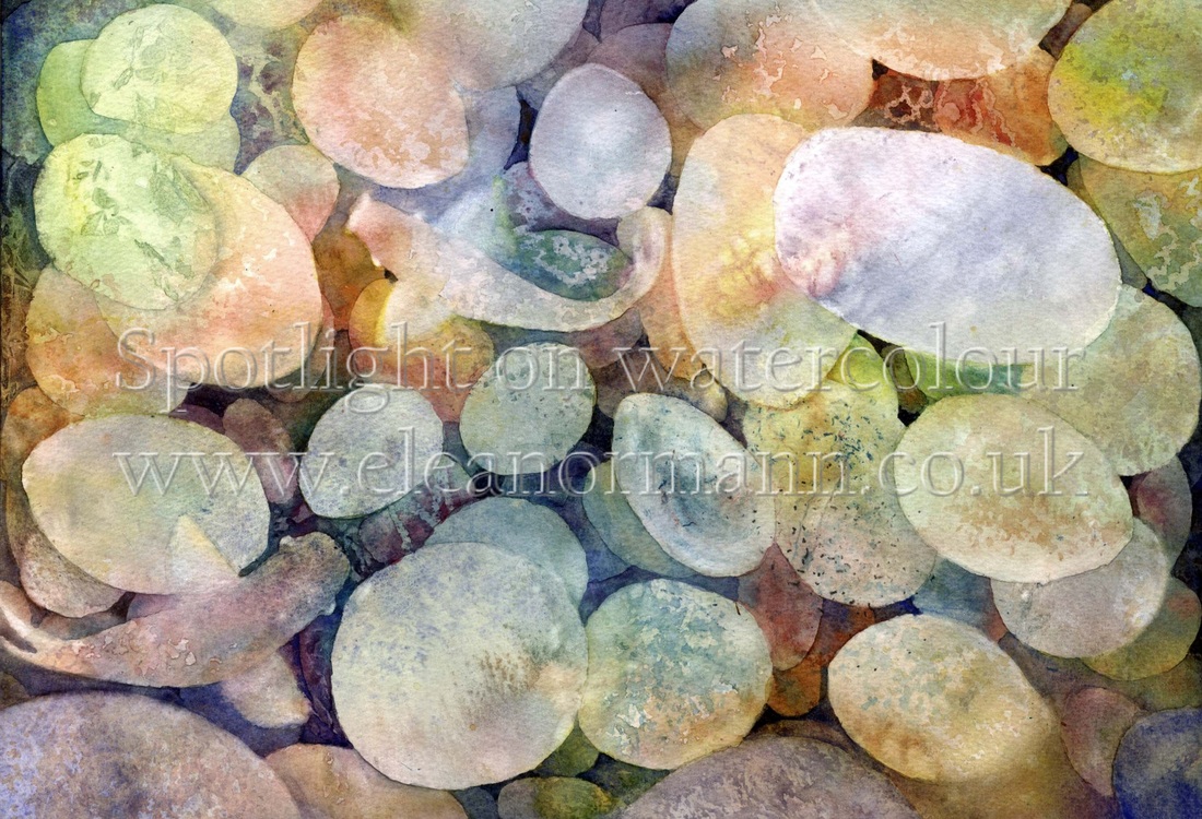
I assessed the painting and found a couple things were bothering me. The pebble at the bottom left was still too light, so I did some sponging on it. The potato shaped pebble above left, was also causing me angst so I have divided it in two by putting a slight shadow under the, now, green pebble.
The pebbles were positively glowing, which is not a natural look, so I have used the complementary opposite colour of the pebbles to wash over them - just here and there.
I've used more sponge, scraping back with the edge of a credit card (left hand image) and coloured graphite (right hand image) which I scraped off the pencil with the edge of a scalpel and scribbled.
I assessed the painting and found a couple things were bothering me. The pebble at the bottom left was still too light, so I did some sponging on it. The potato shaped pebble above left, was also causing me angst so I have divided it in two by putting a slight shadow under the, now, green pebble.
The pebbles were positively glowing, which is not a natural look, so I have used the complementary opposite colour of the pebbles to wash over them - just here and there.
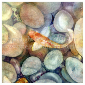
In my forth wash of colour and I found a couple of fish!
The additional textures I've added are wax (left image) and lifting out (right image) using both a brush and a crumpled tissue.
I have added some more granulating colours to the pebbles at the bottom as I felt they were too prominent, being light in tone and at the edge of the picture.
The additional textures I've added are wax (left image) and lifting out (right image) using both a brush and a crumpled tissue.
I have added some more granulating colours to the pebbles at the bottom as I felt they were too prominent, being light in tone and at the edge of the picture.
Now I considered what finishing touches were needed.
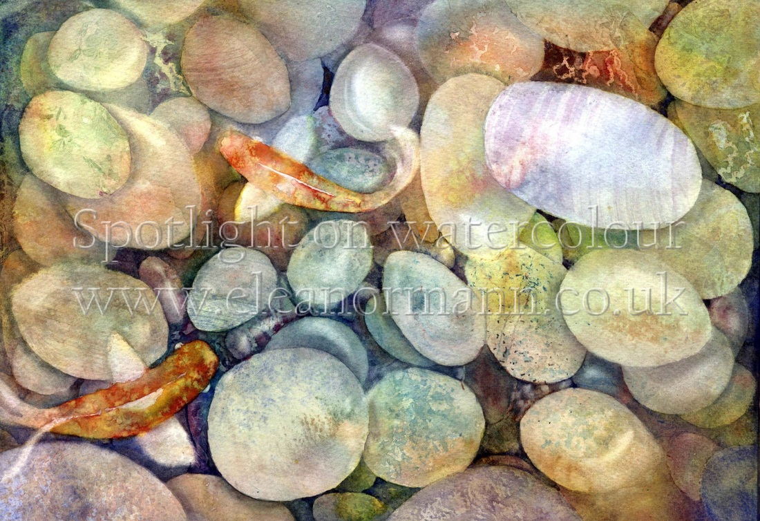
I decided to paint the two fish orange. They looked okay in the early stages but towards the end they looked too dull - more carp than Koi!
I painted cast shadows under some of the pebbles and lifted out highlights on others. I've also dragged a dry brush across a few of the pebbles to give them some pattern (see right).
I'm happier with it now, but I've started another to put what I've learnt into practice!
I have used most of the methods for creating texture in watercolour in this one painting. However I will list all of them, including the ones I missed, in my next article so you have a better reference piece.
A few things I'd like to mention:- the paper (Bockingford, 140lbs, NOT) withstood a lot of rough treatment from me, but held out with no surface damage. Very impressive.
I was amazed at the colours that seemed to appear through the glazes when I lifted out. They looked iridescent and it was a joy to witness.
Lastly, I can't think of many paintings that would necessitate so MUCH texture! Usually you would only use it sparingly and only at the focal point. On the plus side, trying to create texture all over the painting means you can't really make a "mistake". Have a go yourselves and let me know how you got on.
Eleanor
 RSS Feed