Product Review
The Society for All Artists asked me if I'd be willing to do a product review for MaimeriBlu watercolours.
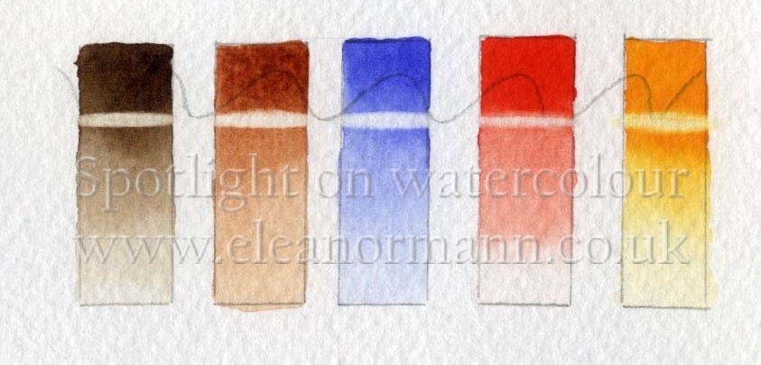
I was sent a set of five, 15ml tubes to test. The colours sent were:- Cadmium Yellow Deep, a rich opaque colour with an orange bias. Cadmium Red Light, again opaque with an orange bias. Cobalt Blue Light, a semi opaque colour, and two earth colours; Burnt Sienna and Burnt Umber both semi opaque.
(Right to left in the example below.)
If I've taught you, or if you've been following my blog, you'll know I do not include opaque paints in my usual palette so it is unfortunate that the set I was sent were all either opaque or semi-opaque. There is nothing wrong with opaque paint as such, it's just that my preferred method of working is to build up layers of colour in glazes and, as opaque paint lifts easily, they have a tendency to make the underlying washes muddy.
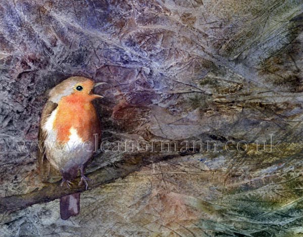
However, if opaque paints are used in a more direct approach, as I have done here, they are easier to control than transparent paints and the fact that they lift more easily means you can lift highlights out of wet or dry washes. Opaque paints are "slow movers" so the wet-in-wet technique would be more easily controllable, if that's your thing. Personally I prefer my paint to be more free flowing.
Opaque paint can, of course, be used in conjunction with transparent paint. I recommend artists get to know the different qualities of the paints and select their colours accordingly. This is explained further in my article on painting with a Limited Palette.
It is also worth noting that paint manufacturers sometimes use the same, or similar, names for their colours, but the actual colours may not look the same, so check before buying.
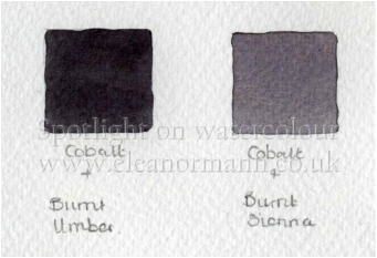
By mixing all three primary colours I was able to mix good greys and blacks as well as by mixing Cobalt Blue Light with Burnt Sienna or Cobalt Blue Light with Burnt Umber, see below.
So, how do they compare in price with my usual brand, Winsor and Newton? Winsor and Newton sell their paint in 14ml tubes, MaimeriBlu's tubes are 15ml. I converted the price of each to find the price per ml. I found they are exactly the same, except for Cobalt Blue Light: Winsor and Newton's Cobalt Blue is marginally less expensive, which came as a surprise to me. However, on all the websites I used to find current prices for each brand I found Winsor and Newton paints were reduced in price. Whether is this is a temporary or permanent reduction I cannot say.
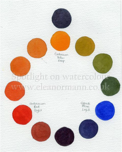
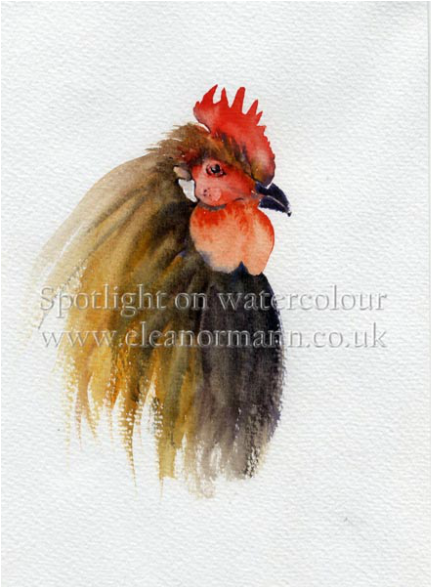
Opaque paints produce strong colour by blocking reflected light. It came as no surprise then that I was able to produce bright yellows and oranges when painting the colour wheel below. I was not able to mix clean violets or greens with the colours I received because the set contained only warm primary colours.
My usual palette consists of three cool primary colours with the addition of three warm earth colours. My reason for this is simple; I can make a cool primary colour warm, by adding red, but I cannot take the red out of warm primary colour to make it cool. This makes warm primary colours less versatile in a limited palette of paints. It is necessary to understand Colour theory in order to understand the difference between a warm and cool colour when buying paint.
My usual palette consists of three cool primary colours with the addition of three warm earth colours. My reason for this is simple; I can make a cool primary colour warm, by adding red, but I cannot take the red out of warm primary colour to make it cool. This makes warm primary colours less versatile in a limited palette of paints. It is necessary to understand Colour theory in order to understand the difference between a warm and cool colour when buying paint.
Overall I don't think I'll be switching brands whilst the price of Winsor and Newton's paint remains low, but I do feel that they were of equal quality in terms of pigment. I would be interested in testing the primary versions of the MaimeriBlu paint though.
Which one brand of paint would you recommend? Or do you have a few different brands in your palette?
Eleanor
Which one brand of paint would you recommend? Or do you have a few different brands in your palette?
Eleanor
 RSS Feed