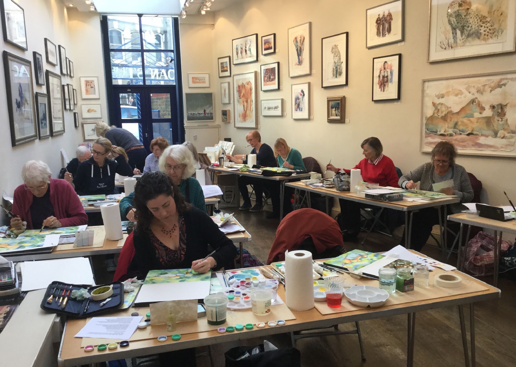
Watercolour workshop with Hazel Soan
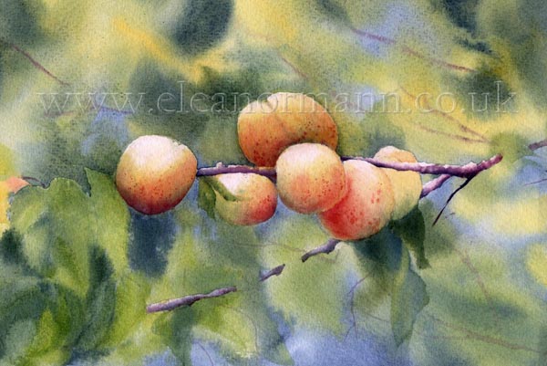
Following demonstrations by Hazel we painted six pictures over two days mainly using a limited palette of one yellow, one red and one blue, see below. The colours were chosen by Hazel for their properties rather than their hue which is something I am also passionate about.
This was our first painting. My hands shook as I drew and tried to remember everything Hazel had done and said during the demonstration.
Colours used were:-
Aureolin a cool, transparent, staining yellow and Indian Yellow a warm, transparent, lifting yellow combined wet-into-wet with Prussian a cool transparent, staining blue. Both warm and cool yellows were chosen to highlight the different greens that can be made using one warm and one cool yellow combined with a cool blue. The red used was Permanent Rose a cool, transparent, staining red.
Hazel explained that these earth colours were all made from one pigment, for example Raw Umber is heated to produce Burnt Umber etc. This makes them ideal to use as tonal increments - so although lots of colours were used to produce this painting many of them are different versions of one pigment.
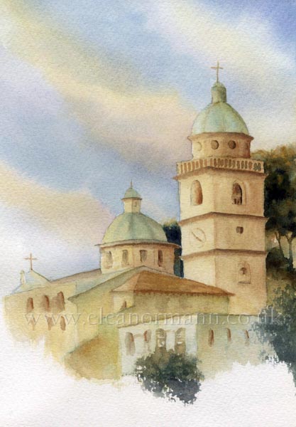
The blue in this painting was Prussian a cool transparent, staining blue. Prussian blue combines beautifully with any of the above colours to produce delicious, dark greens.
Since the workshop I, a rebel in small ways, have muted the yellow in the sky with violet to dull it slightly and create more contrast with the buildings.
Colours used:- Cerulean a cool, opaque, lifting, granulating (in the Winsor and Newton range) blue helped enhance the feeling of misty light. Yellow Ochre a warm opaque, staining, earth yellow was used in the path and in the sky. Indigo a cool opaque, staining dark blue was used with Cadmium Red a warm, opaque, granulating, lifting red in my painting but I think other students used Sepia a cool opaque dark brown to produce the dark tones.
Indian Yellow a warm, transparent, lifting yellow combined with Cadmium Red a warm, opaque, granulating, lifting red made a warm orange. Blue is the complementary opposite of orange and serves to enhance the brightness of both colours. The blue in this case was Cobalt a warm semi-opaque, lifting, sometimes granulating mid-tone blue. The dark tones were mixtures of the colours above plus Winsor Violet.
Hazel was introducing her signature set of watercolour pans made by Schmincke. We found some of the colours in their range had different names (as is the way of the many watercolour paint manufacturers). Schmincke's version of Winsor Violet is called Mauve.
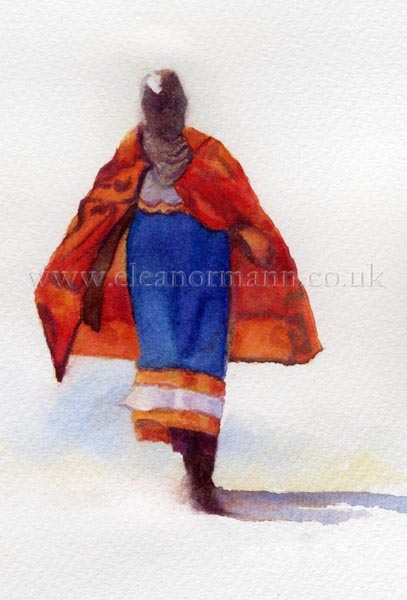
I made a rookie mistake on this one; having made the shawl on the right rather dark in tone and "muddy" by over mixing (probably in a panic!). I decided to change the direction of light on the reference picture from right to left. I remembered to change the highlight on her head, however, when it came to the shadow on the ground I painted it on the wrong side as per the reference photo! Thankfully I noticed in time and was able to lift it out sufficiently and then paint it correctly on the right hand side. This illustrates the beauty and beast of opaque colours. Quick to make "mud" they also lift easily. This, of course, should never be relied upon though.
Colours used:-
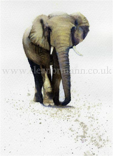
Hazel began with Aureolin a cool, transparent, staining yellow - painting almost everything except the highlights. Whilst this wash was still wet she added French Ultramarine a warm transparent (according to Winsor and Newton but semi-transparent, at best, in my test!) granulating and lifting blue and held it up for us to see - an elephant! Amazing! She then went on to paint the dark tones and shadows all wet-into-wet.
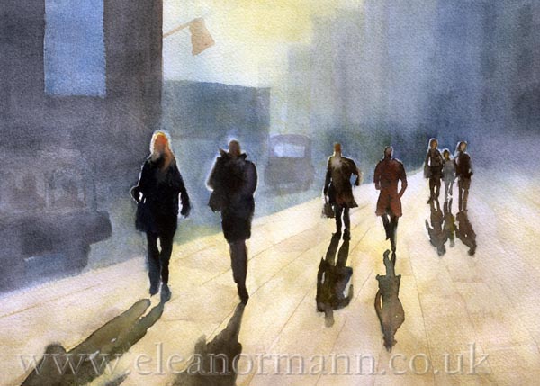
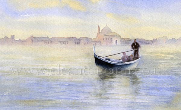
Colours used:- Yellow Ochre a warm, opaque, earth yellow and French Ultramarine a warm transparent (?) granulating and lifting blue were used in the sky and water. A warm yellow, such as Yellow Ochre or Raw Sienna is perfect to warm up a sky with a warm blue as they will not turn immediately to green unless you stirr them up with your brush when applying - which you should never do to any colour anyway. The red in this painting is Cadmium Red a warm, opaque, granulating, lifting red, in this case used in a very light tone which mixes beautifully with French Ultramarine to produce soft warm violet/greys. By combining them in this way it prevents the red from coming forward too much in the painting as warm, opaque colours tend to do.
People say you shouldn't meet your heros as you will be disappointed. Not so with Hazel Soan she was as magnificent in life as I could ever hope her to be. I feel honoured to have been given the opportunity to meet her and paint in her company.
Many thanks to Hazel Soan and my friend, who made it possible.
All reference pictures are copyright Hazel Soan.
My painted versions above are published with the kind permission of Hazel Soan.
The Gallery/Soan Studio
Crookham Road
SW6 4EG
London
United Kingdom
hazelsoan.com
allsoanup.com

 RSS Feed